

You’ve generated your simulation results and you want to communicate your findings with other people. To do so clearly and effectively, you will need to create easy-to-understand, eye-catching visualizations. Therefore, as of COMSOL Multiphysics® software version 5.2a, you now have six new color tables to further enhance your postprocessing. Let’s learn about the inspiration behind these color tables and take a look at a few specific use cases.
Drawing Inspiration from the Stars (and Science Fiction!)
If you look up to the sky on a clear night, you may see the inspiration for our new color tables: the cosmos. These new color tables are a tribute to space research and science fiction. In order to discover their individual inspirations, let’s take a small tour through space.
The Twilight color table, as its name implies, is inspired by NASA images of the rising sun. In these moments, the sunlight creates multicolored layers on polar mesospheric clouds, as shown below. We used this inspiration to create a color table with ten color levels, which the software interpolates between.

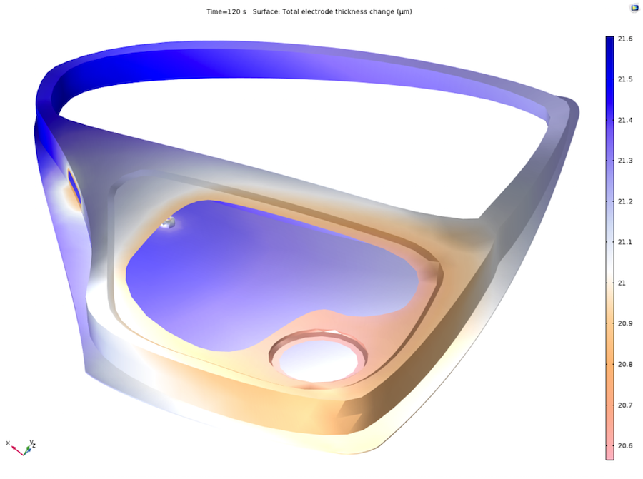
A NASA Johnson Space Center photo showing the Endeavor and sunlight illuminating polar mesospheric clouds (left) and simulation results showing the electrodeposition of a car door with the Twilight color table (right).
The Aurora Australis and Aurora Borealis color tables are both named after a well-known natural phenomenon in which solar winds traveling through space interact with Earth’s magnetic field. This results in an awe-inspiring light show that appears to paint the sky a rainbow of different colors. The vibrant colors of the Aurora Borealis (northern latitudes) and Aurora Australis (southern latitudes) are reflected in these color tables. COMSOL Multiphysics version 5.2a offers eight color levels for the Aurora Australis color table and ten for the Aurora Borealis color table.
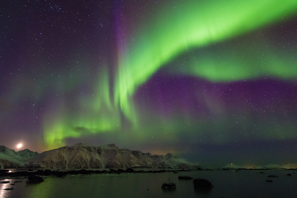
The Aurora Borealis (left). Image by Carsten Frenzl — Own work. Licensed under CC BY 2.0, via Flickr Creative Commons. A pressure field around an Ahmed body, visualized with the Aurora Borealis color table (right).
Venturing out further, we find the inspiration for our next color table, Jupiter Aurora Borealis. These colors are influenced by ultraviolet images of the largest planet in our solar system, Jupiter. One such photo, shown below, depicts auroras on Jupiter’s surface. This ultraviolet visualization guided the creation of nine color levels for the Jupiter Aurora Borealis color table.
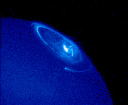
Auroras on Jupiter’s surface (left), taken by NASA’s Hubble Space Telescope. Image Credit: NASA/STScl. The flow of droplets around an inkjet nozzle, using the Jupiter Aurora Borealis color table (right).
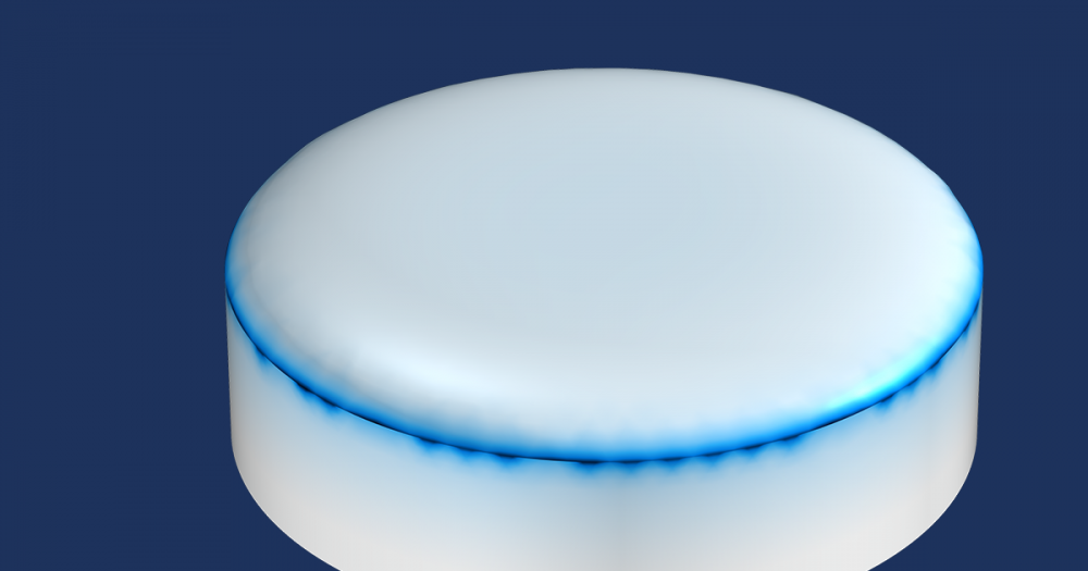
Finally, let’s take a look at our Heat Camera and Heat Camera Light color tables, which draw inspiration from a certain famous creature from science fiction movies: the Predator. In the Predator films, extraterrestrial hunters chase their prey using thermal vision, that is, they see infrared radiation. The Predators can also switch color tables, further enabling them to search their landscape for prey. Our own Heat Camera color tables resemble this fictional thermal vision as well as the color tables of actual heat camera technology. Eight color levels are included in the Heat Camera color table.
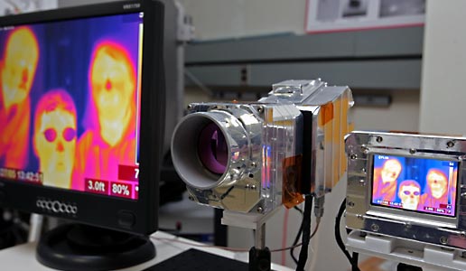
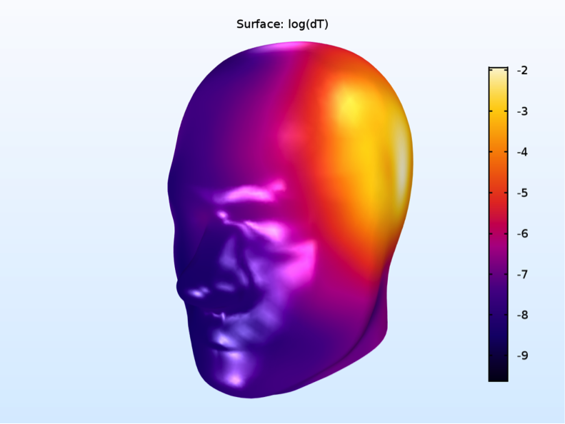
An infrared camera (left). Image taken by NASA/John Bethune. An increase in logarithmic temperature in a SAM phantom, shown with the Heat Camera color table (right).
Color tables offer much more than just visual appeal — they also expand the visualization capabilities of COMSOL Multiphysics. We’ll take a look at some concrete examples in the next section.
Color Tables: Where Eye-Catching Results Meet Functionality
While all of our color tables are multihue (include multiple colors), they differ in other ways. For instance, these color tables include both sequential color scales, which monotonously transition from lighter to darker colors in only one direction, and diverging color scales, which plot the lightest or darkest color in the middle and become darker or lighter (respectively) on each side. When picking the right color table for the job, you may need to choose between sequential and diverging color tables, with each option offering different benefits.
For instance, sequential color tables are preferential for visualizing heat transfer and CFD simulations. My colleague Ed Fontes mentions the colors in the Heat Transfer Module as an example. Here, the default colors are red and yellow. Such colors bring up certain associations, like the glow of iron that is about to melt or a burning stove top. The instinctual nature of these associations makes your simulation results easy to interpret.
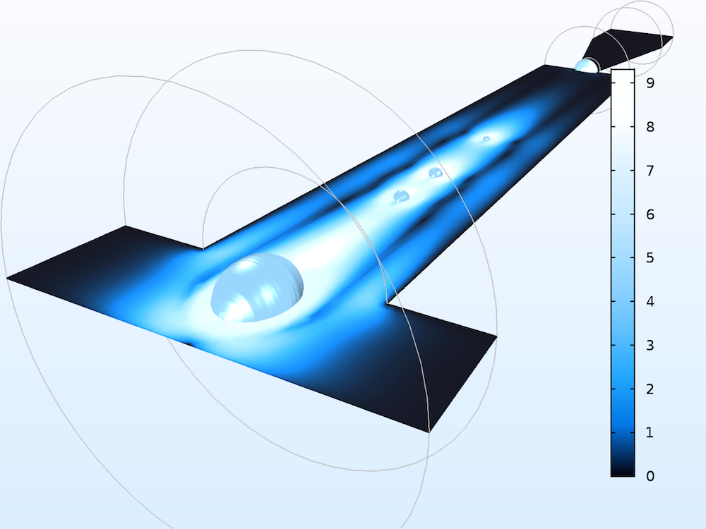
Let’s look again at the new Jupiter Aurora Borealis color table, which, unlike the other aurora color tables, has a relatively small color variation consisting of a range of blues. Blue colors like these are commonly associated with water, with darker colors signifying deep water and lighter hues representing more shallow water. As such, this color table would be a good choice for fluid flow simulations. The visual below and to the left uses the Jupiter Aurora Borealis color table to illustrate the topology of a wave in a microchannel, with the color variation indicating the distance to the water’s surface.


CFD simulations showing a wave formed by water flowing through a narrow channel. Images created using the new sequential Jupiter Aurora Borealis color table (left) and the diverging Twilight color table (right).
Sequential color scales are not necessarily the best way to display your results. It all depends on what’s right for your unique simulation needs. Although most of our new color tables are sequential, there is one notable exception: the Twilight color table, which is classified as diverging. Diverging color tables, as Ed Fontes explains, help to highlight a significant element in your design by using a brighter or darker color in the middle of the scale. Such color tables are often used to show a transition level of a field.
To learn more, let’s return to our fluid flow example from before. Unlike the Jupiter Aurora Borealis color table, the Twilight color table clearly defines the water and air phases by using different colors on either end of the scale, as seen in the image above and to the right. It also utilizes the bright value in the middle of the scale to highlight a transitional phase, enabling you to differentiate between three different aspects of your simulation results.
Further use of the diverging Twilight color table is highlighted in the following image of a simulation of electromagnetic waves propagating through an elbow waveguide. With the Twilight color table, the positive (blue) and negative (tan) colors of the z component of the electric field are defined in a straightforward manner.
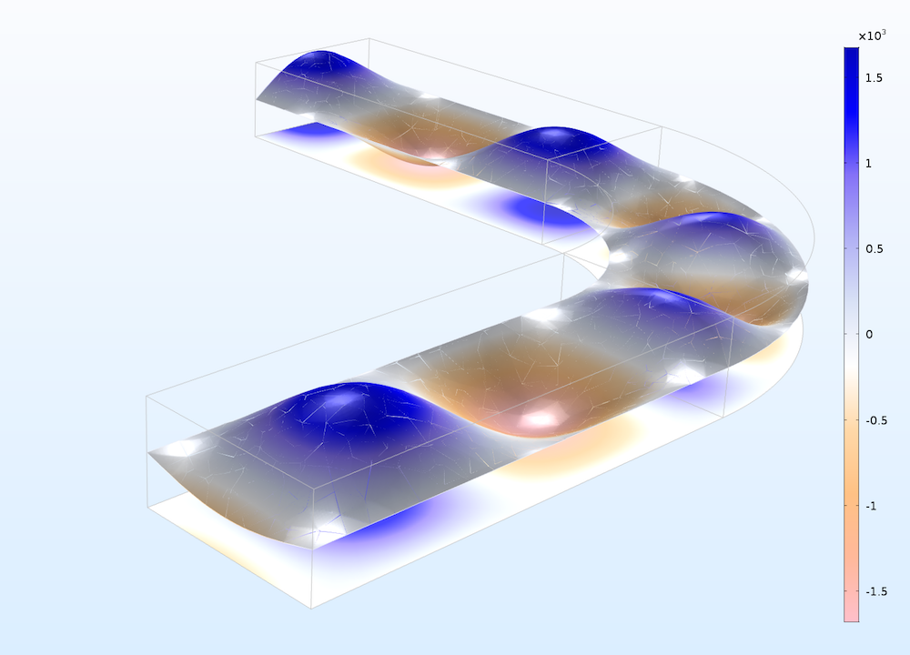
Electromagnetic wave propagation in an elbow waveguide, using the Twilight color table.
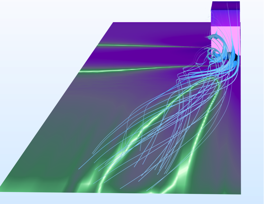
You can also use multiple color tables at once to observe details that would not be noticeable with a single color table. Two colors tables can help you simulate the magnetic flux around a permeable magnetic sphere that is subjected to a background magnetic field. In this case, we selected the Jupiter Aurora Borealis color table to show magnetic flux at the outer boundaries and the Aurora Borealis color table to show magnetic flux density within the modeling domain and the permeable sphere in the core. As another example, we used the Aurora Australis color table and Jupiter Borealis color table to visualize the electron temperature and magnetic vector potential streamlines with color representing the intensity of the electric field, respectively.
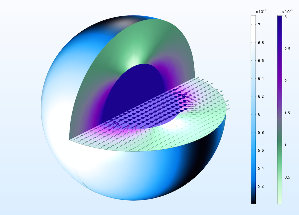
Results using the Jupiter Aurora Borealis (left scale) and Aurora Borealis (right scale) color tables to help visualize results from a magnetic permeable sphere simulation.
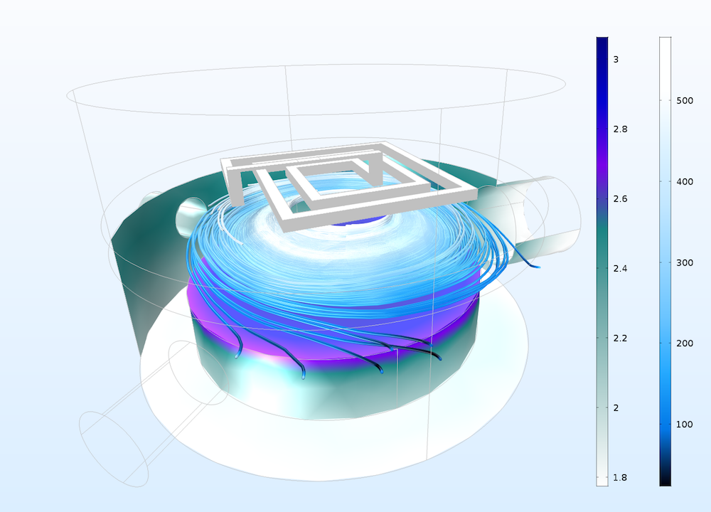
Results using both the Aurora Australis (left scale) and the the Jupiter Aurora Borealis (right scale) color tables.
New Color Tables Deliver Greater Visualization Capabilities
Postprocessing is a powerful tool for better understanding and communicating simulation results. The six new color tables highlighted here aim to extend the visualization capabilities of COMSOL Multiphysics, combining eye-catching results with useful applications. Browse the different options to find the color table that best suits your simulation needs…
Learn More About Enhancing Your Simulation Results in COMSOL Multiphysics®
- Learn how to manually change the color range in a color table
- Browse additional postprocessing tips and tricks
- See what else is new in version 5.2a of COMSOL Multiphysics® in our Release Highlights
The National Aeronautics and Space Administration (NASA) does not endorse the COMSOL Multiphysics® software.

Comments (0)